Get Happiness Is A Magnet WordPress Theme at 60% Off. Use code SALEHAPPINESS at checkout!
Don't Miss A Thing!
Get The Goods!
Powerful Email Marketing
Drive powerful results with signup forms, landing pages, automations, sequences, real-time reporting, and more.
Looking for Something?
I know what it’s like to get started. As a blogger myself, I was in beginner’s shoes once. Starting as a new mom who hired a website designer, I quickly discovered that I wanted to make it easy, convenient, and simple for anyone to start their own boss babe empire or develop their passion.
READ MORE
Hey Y'all
Boss Babe
Templates
wordpress themes
view wordpress themes
The Making Behind Studio Mommy and What’s New!
We’re live! A Mommy’s Blog Design is now Studio Mommy! I am so excited that it’s finally done and I can share it with you!
Why the change? Many different reasons.
1. The original name was way to long and I wanted something short and simple. I really wanted ‘Studio Mom’ but that was already taken. It’s okay though, Studio Mommy still has a piece of my original name in it.
2. I’ve been away from my site for almost a year now after my 3rd baby was born last September. I struggled trying to keep up with everything in life, with a new baby and all, so my website got put on hold for a while. Now that my older children are back in school and my 1 year old is starting to get on a schedule… I’m hoping to bring you more adorable and chic designs. I wanted my design and name to reflect the new vision I have.
3. I also would like to take this website and blog in a different direction. I want to bring more of my family & myself into it. Blog Designs are still the main reason behind this site but I would like to show you who I am, what I like, and share with you my amazing family. I would like to show you what drives me and how I get inspired to create the master pieces I make (my family is a big part of that).
The New Design
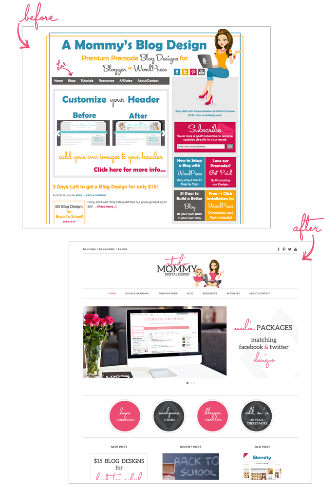
Don’t get me wrong. I loved my original design but I felt that it was to, um, busy. Yeah, busy, that’s the right word. There was so much going on and so many colors. It took away from the posts and premades.
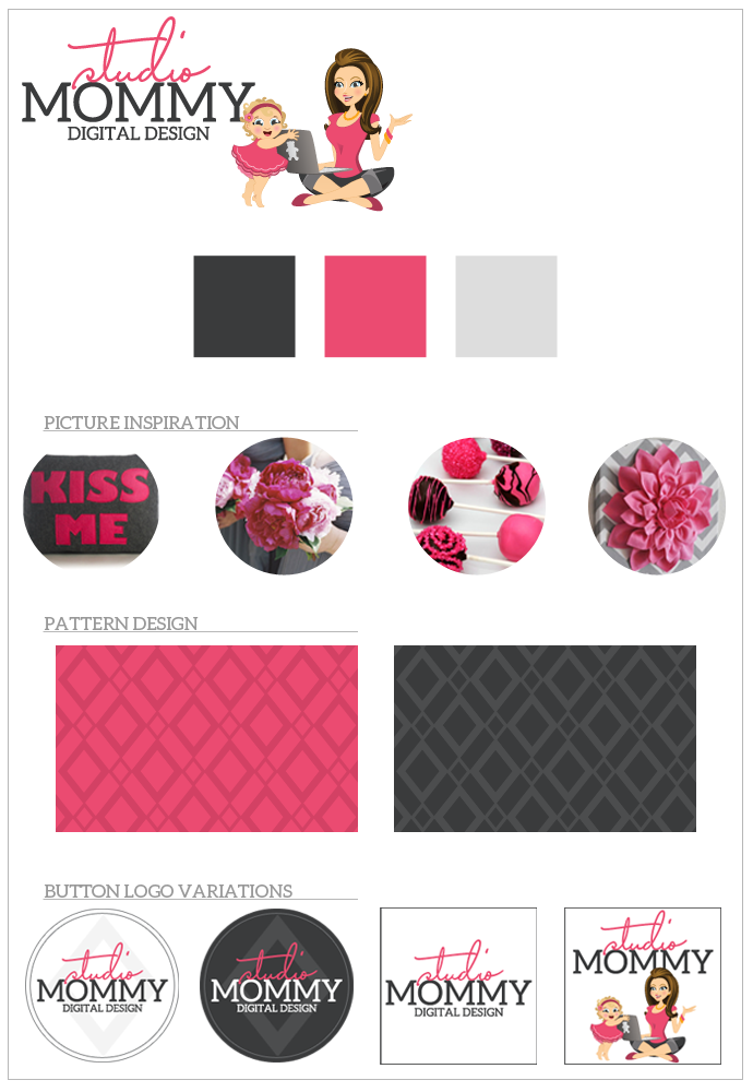
I knew I wanted something more simple, clean, modern, chic, you get the idea. I’ve been recently browsing a lot of photography and wedding sites. They kind of go hand-in-hand and these sites are what inspired me to take this blog & design in that direction. Here’s a peak at my inspiration board.
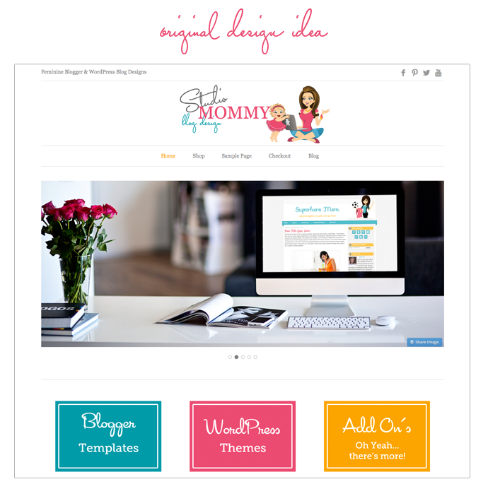
You remember I mentioned I wanted to incorporate more of my family into the site? I knew I wanted to keep my adorable illustration by Miss Pickles (she’s totally awesome, check her out) but I didn’t want my whole family illustrated (trying to keep with the simple chic look). So I decided to add a cute little girl, with ruffle bottoms, trying to peak over my computer. Adorable right? She reminds me a lot of my 1 year old and she represent my whole family. The original color ideas were blue, pink, and yellow but once I started designing the site I felt like it was getting to busy again with colors. I do love colors but I still wanted something more simple. Here’s the original design idea I had in mind and what the illustration colors were before I changed them.
 I decided in the end to stick with one primary color – pink (yeah) and throw in some charcoal gray.
Here is a list of resources I used to make this change. I’ve also added the new ones to my list of resources.
- Genesis Framework by StudioPress- I can never brag enough about this framework. My site (as well as all my other WP Themes) is built on WordPress.org using Genesis. Gensis makes it so easy to customize my designs & anytime there is an update… I do not loose a thing. Sweet, right? If you are a WordPress user then you know what I mean 😉 Plus it has awesome SEO settings and many layout/widget options.
- Swank Theme – I wanted a more mobile responsive theme (take a look at my site on your phone or tablets!) so I was browsing around for ideas. As soon as I saw the Swank Theme by Lindsay I was in love. It had everything I was looking for; modern, chic, simple, clean. I made a lot of changes to the theme to suit my site vision and I think it turned out awesome.
- RFE Hosting – this site wouldn’t be possible without my hosting company. I’ve been using them for the past 3 years now. I needed some help changing my domain name and they were happy to step in and help. I also added an SSL Certificate to the site which makes your shopping experience even more secure. Yay!
- Miss Pickles – yup, she did it again! Miss Pick les and I have worked together for a few years now. She created my cute illustration and all the others you see on my premades. She takes your ideas and makes it happen!
- Fonts – sites I used to find the perfect fonts are; MyFonts, Google Fonts, WordMark, FontFabric and CSS Font Stack.
- Plugins – there are a few new plugins I discovered too; Greg’s Threaded Comment Numbering, Image Widget, and Simple Social Icons.
I also updated my ‘about’ page. It was out dated with information and my photo was ancient. Come take a look!
Photo Images used in the Inspiration Board are from Pinterest & Etsy.
I really hope you like my new simple, adorably chic design! I would love to know what you think 🙂
Hi 🤗! I want to help you create a website you love 💕 where you are excited to work or blog. Come see our easy to use, feminine, beautiful designs.
WordPress Themes
You’ve put in the work to make awesome content, now it’s time to dress up your site with a stunning design.


facebook
twitter
pinterest
share & save:
xoxo, april